
Captain Dave's Branding and Packaging

My friend David is quite the renaissance man. He is an engineer, a sailboat captain, and artisan who rocks a ginger beard.
Needless to say, I wasn't surprised when David mentioned he was starting his own LLC and launching two products. He and I met up for coffee to walk through his vision and iron out some must haves.

Our Mission
Create branding and apply it to packaging.
Create brand typography and styling that could carry across multiple products
Nautical theme with illustrated elements
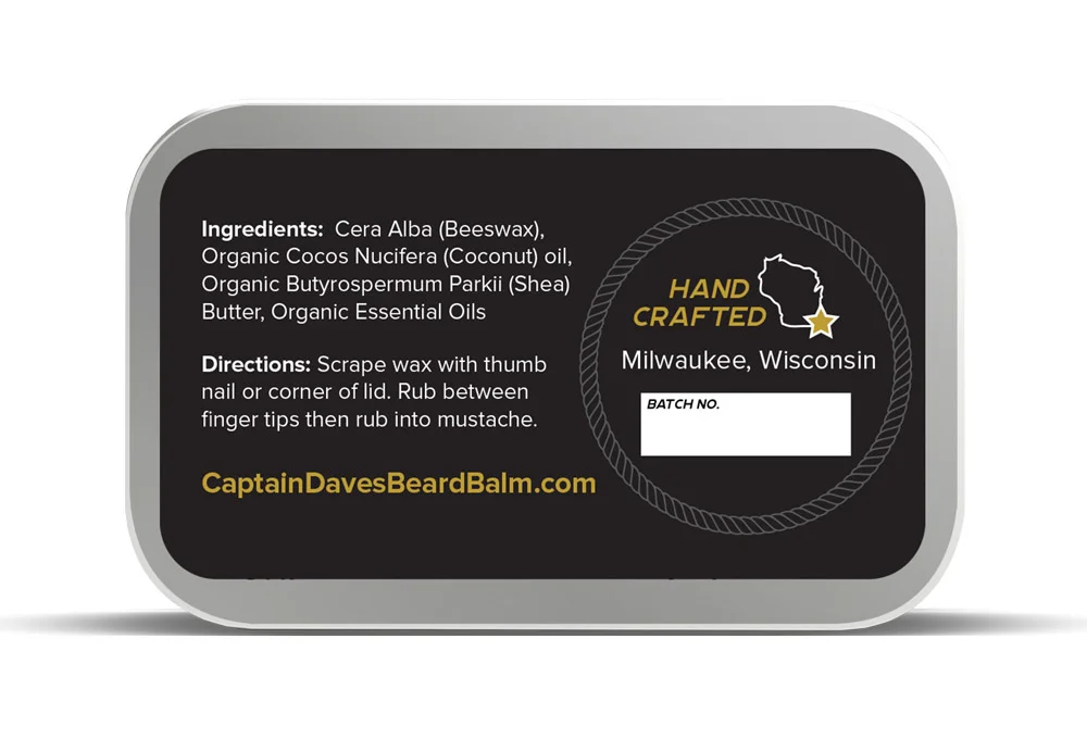
Use a color palette that focused on black and gold
Include a "Handmade in Milwaukee, WI" treatment
Must use stickers at a size that fit the pre-selected tins and online vendor options
For a handmade touch, include a space to write a batch number
The Solution
Taking into consideration David's requests, I mapped out color palettes, collected competitor branding, and selected inspirational imagery. This served as a conversational piece that David and I used to identify what represented his brand best and allow us to set clear direction. David's brand would be bold, nautical, and eclectic.
The selected branding features a black backdrop allowing for maximum contrast to the white type and illustrations. Gold accents key areas. A mix of script and all-caps serifs match the the juxtaposition of manly facial hair and use of a beauty product. Wave illustrations adorn the brand to mimic hair or curls. Final packaging also took into account all initial requests and production needs.
David was a pleasure to work with and I look forward to working with him again on his upcoming products!

David shared a few kind words about our design process and results.
“Working with Carly was wonderful. I had a list of ideas but nothing too concrete. She did a great job of helping me clarify my ideas and figure out what I wanted. She provided a sheet with a few concepts and we worked together to quickly come up with a primary design. ”

“I can’t even count the number of compliments on the labels for my Beard Balm and Mustache Wax, like ‘I really love your branding!’”


“Carly later helped me plan and create assets for my website. It was a pleasure working with Carly on designs for my products. I will definitely be coming back to her as I create new products as well!”